ArtioTour
Elevating the art gallery experience through digital design
Role:
Solo product designer, UX researcher
Product:
Mobile app for iOS
Duration: 3 months (June - September 2022)
Tools:
Figma, Adobe Illustrator
Duration:
6 months (July-December 2022)
Why ArtioTour?
Problem: Despite being a free resource available to the general public, art galleries are considered by many to be inaccessible, snobby, and boring.
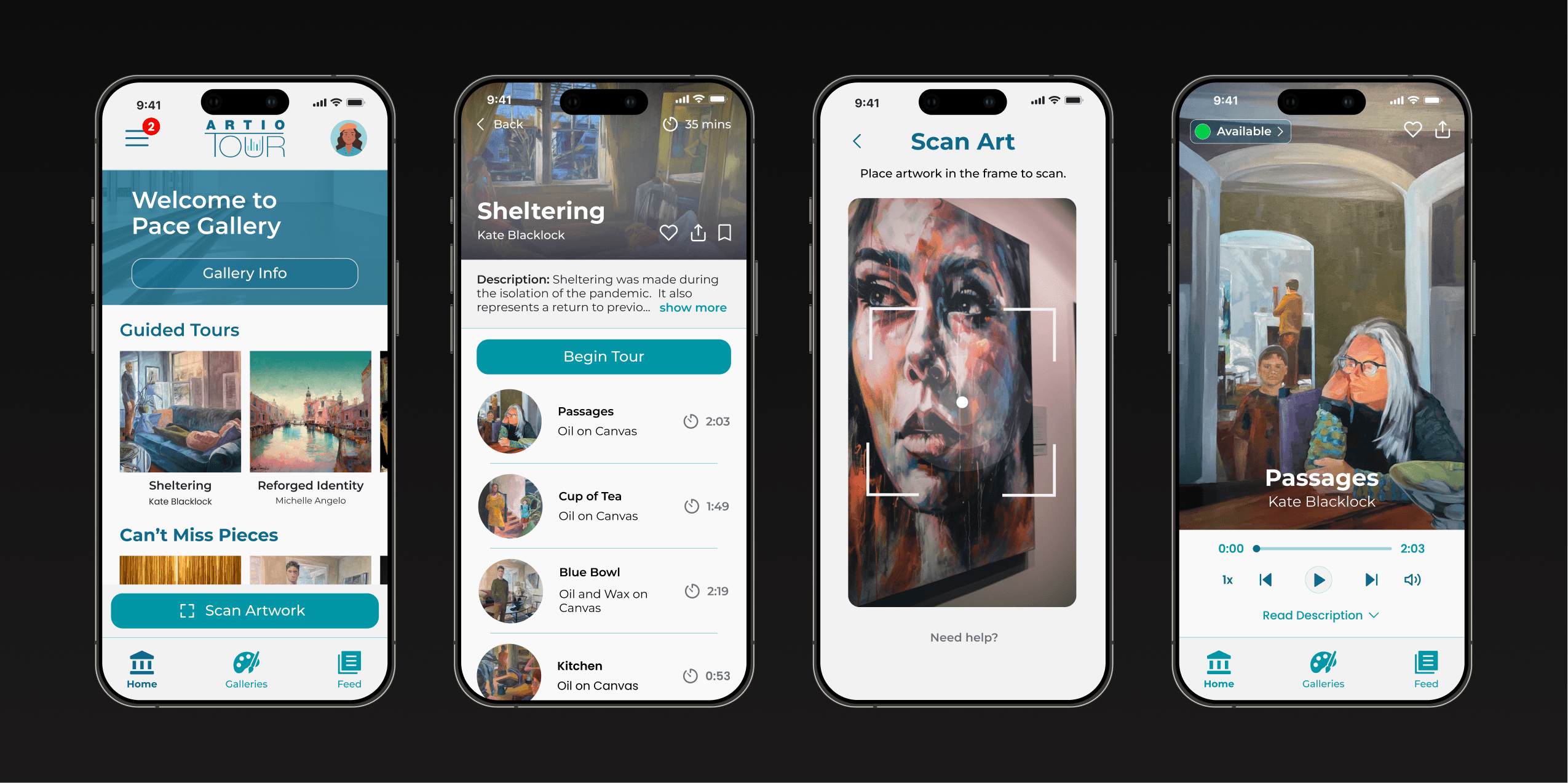
Solution: A mobile product that solves the most common challenges with galleries, giving users an accessible, engaging, and enjoyable art viewing experience.
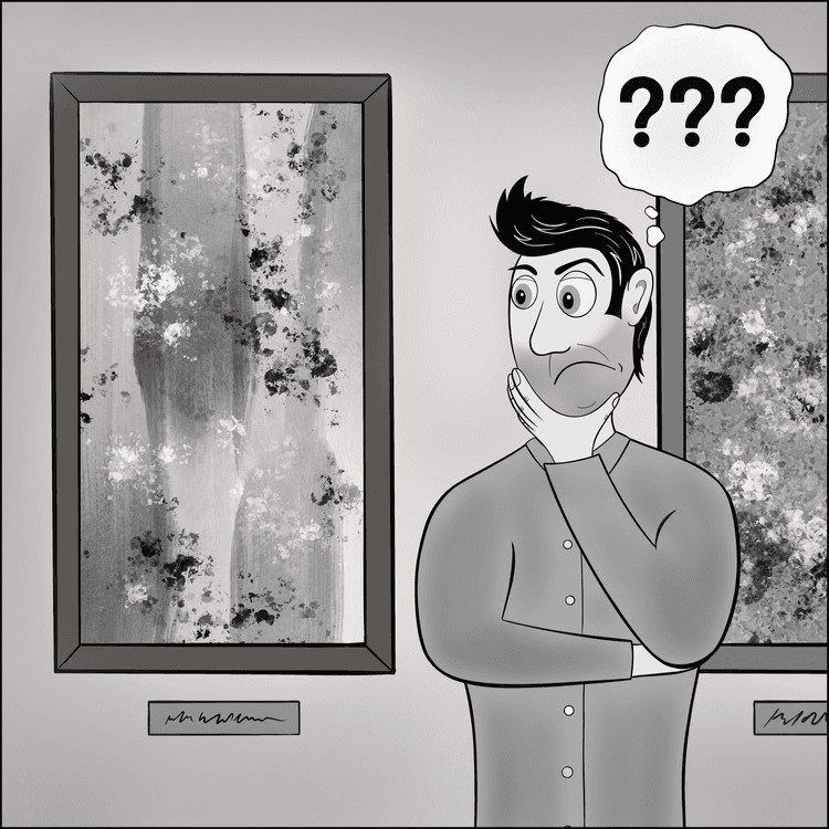
Paolo loves going to galleries with his family, but always struggles to understand the art.
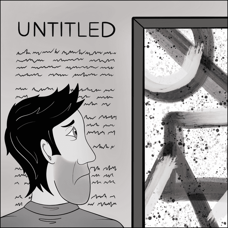
He hates spending time and energy reading long descriptions…this was supposed to be a fun activity!
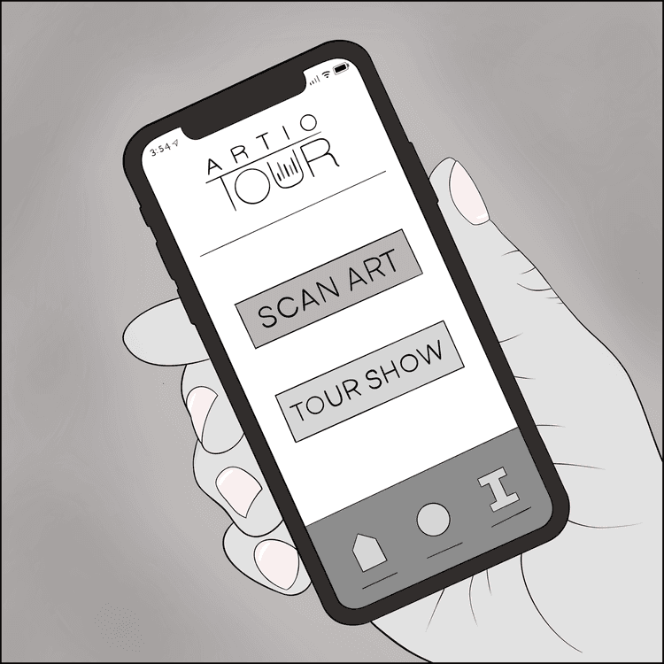
Luckily, he remembers his friends told him about the ArtioTour app— a game changer at art galleries!
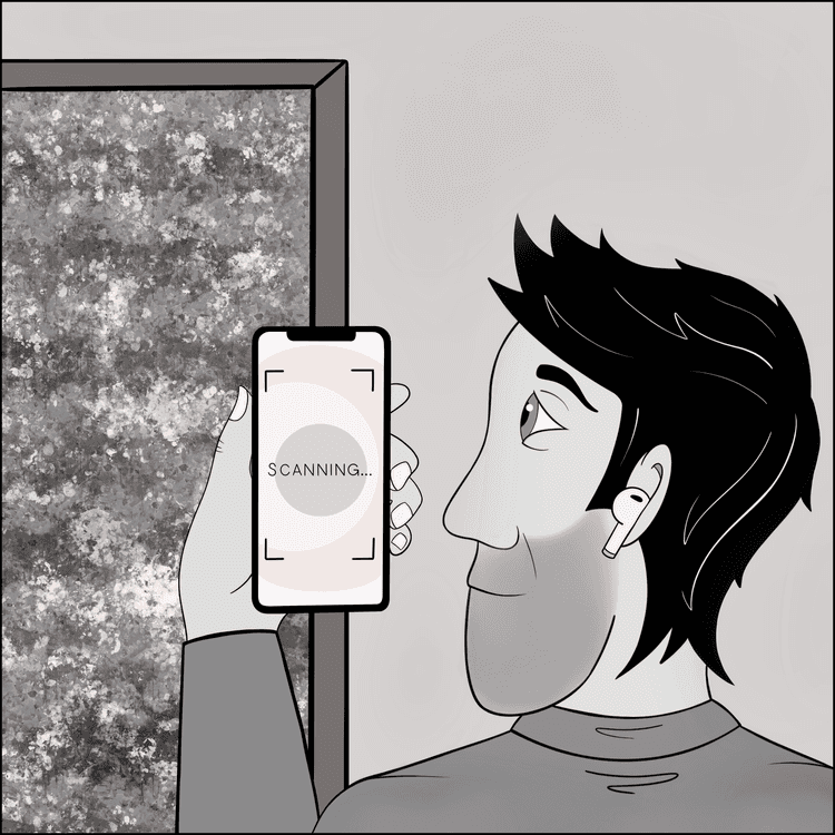
With ArtioTour, Pablo can use his mobile phone to scan the artwork in front of him…
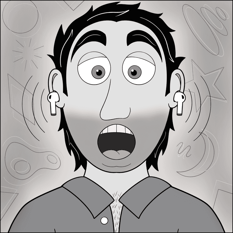
…and receive an entertaining and educational guided overview, directly to his headphones!
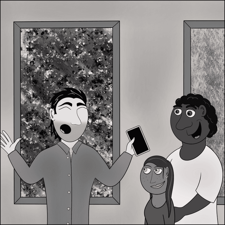
Now, Paolo can feel like a true art aficionado and share his learnings with his husband and child.
Research & empathize
I began by identifying my research goals: Understand the biggest challenges people face at art galleriesDiscover what people enjoy most about the art gallery experienceDetermine the best way to deliver an audio/visual tour on a mobile device
Industry research & benchmarking
I conducted primary and secondary research on the art gallery and audio tour industries. My secondary research consisted mainly of reviewing online publications, articles, blogs, and case studies, to gain a comprehensive understanding of the market. I found the following resources particularly helpful:
User interviews & personas
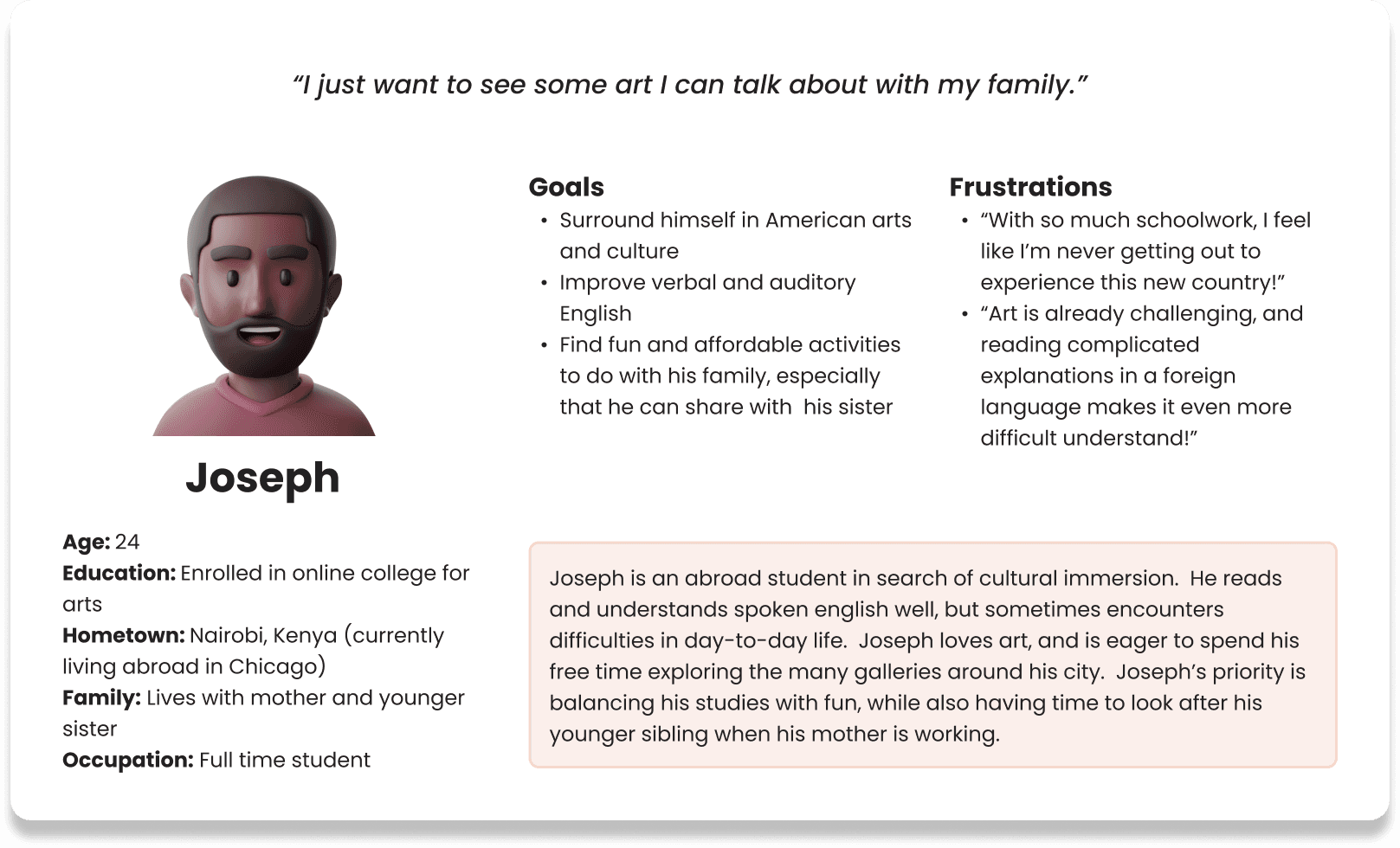
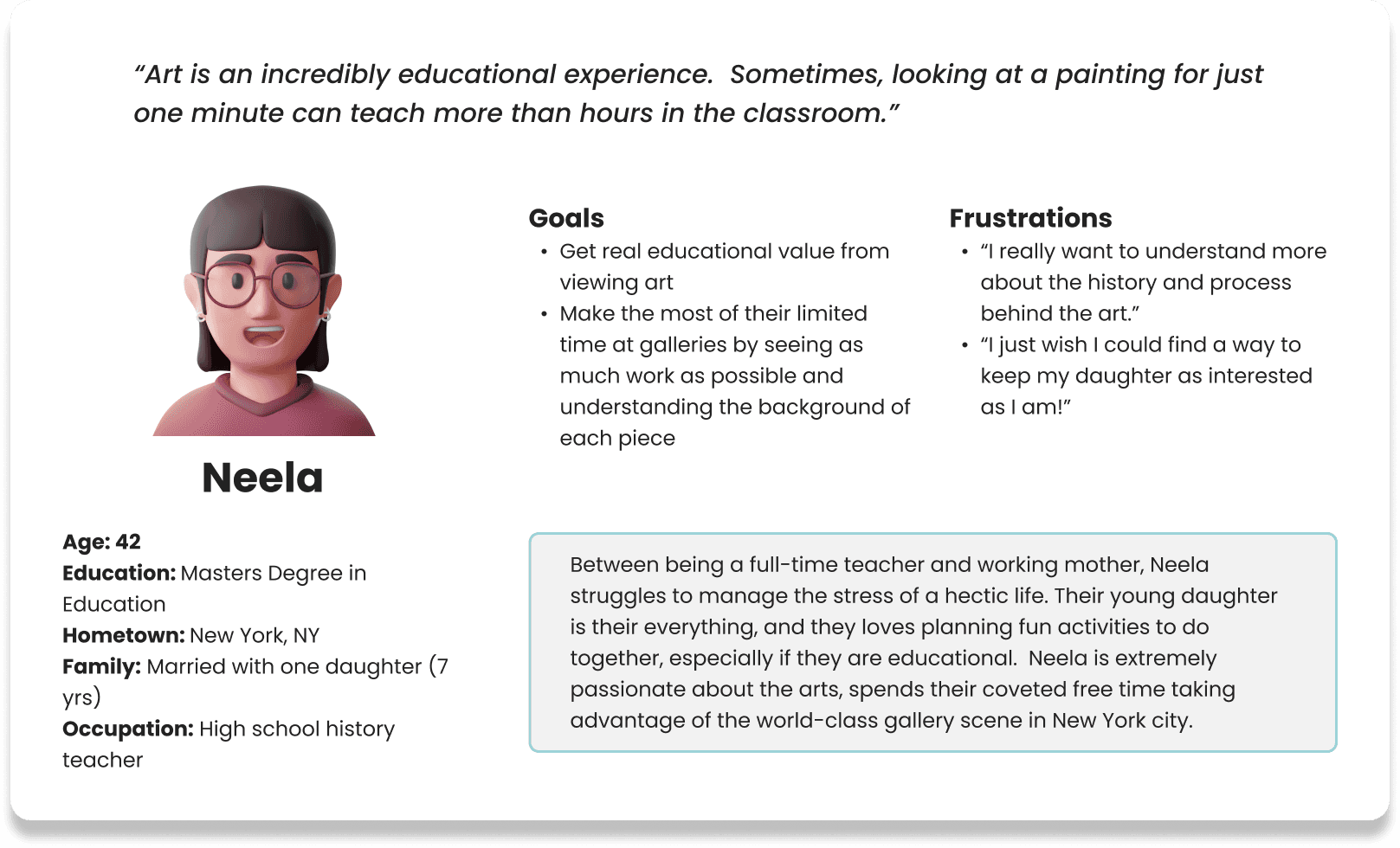
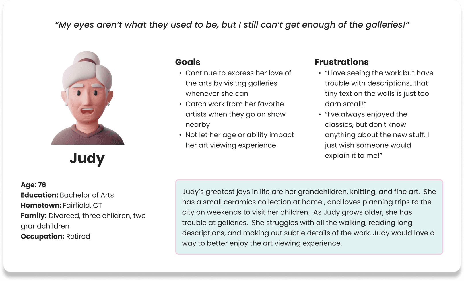
I administered six in-person interviews to understand the different aspirations, challenges, and objectives people have when visiting art galleries.Participants were chosen from a variety of backgrounds, representing diversity in race, gender, ability, and art gallery experience. Next, I gathered my interview findings to construct three user personas. These fictional characters represent important segments of ArtioTour’s target audience.
User journey mapping
Now that I had an understanding of the market, I created user journey maps to visualize the process art gallery visitors take to accomplish their goal.
This is the user journey map I created for Joseph, a college student from Kenya living abroad in Chicago:
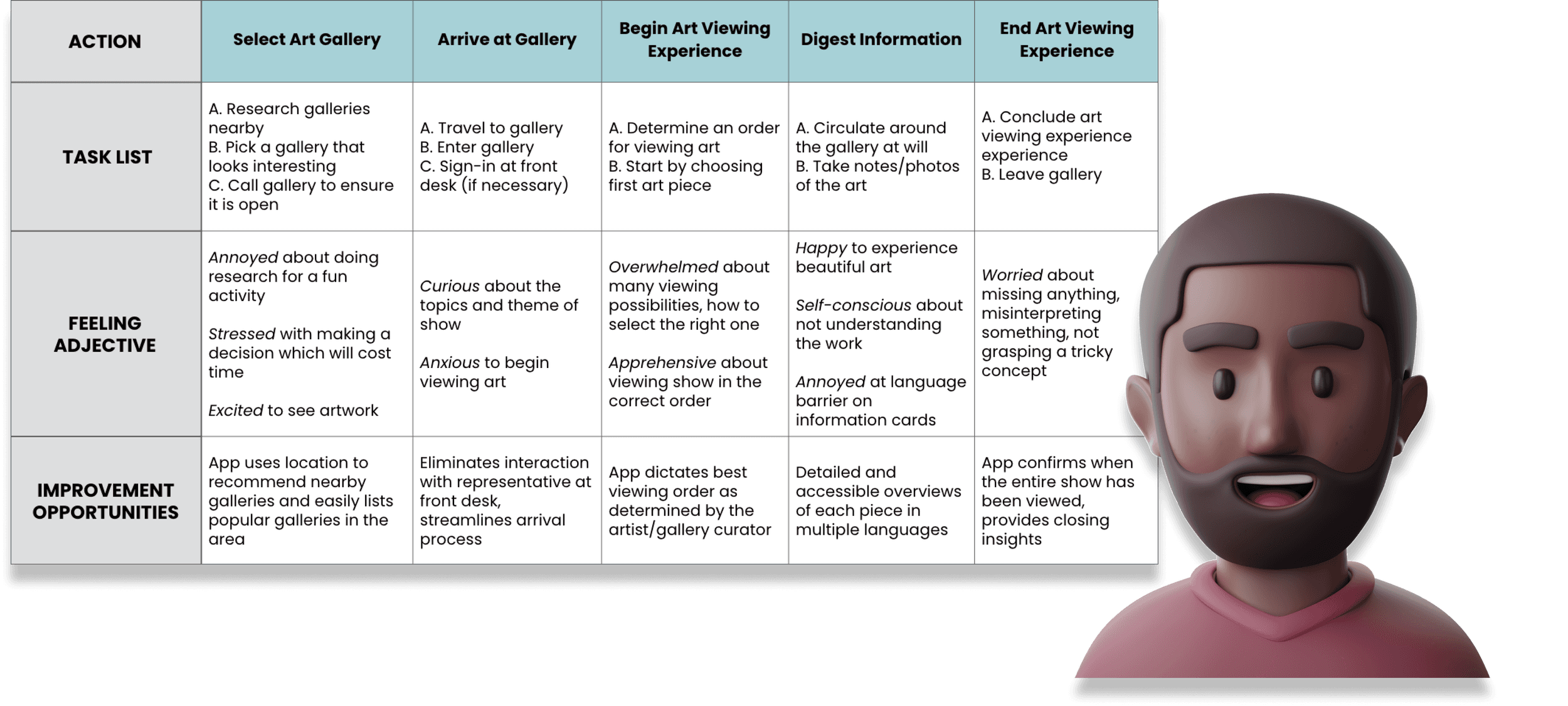
I now had enough information to identify common pain points and goals with the art gallery and audio tour experiences:
Pain points:
Gallery assistants, when available, can be unhelpful and rude
Lack of informational content and readily available resources to learn about the artwork on display
Audio tours associated with lugging around old, clunky, annoying equipment
Goals:
Gain insight into the history, process, and meaning behind the artwork
Interact and engage with art an accessible, educational, and fun manner
Keep track of and share the galleries, shows, and pieces you see
Competitive Audit
Continuing my research, I conducted an analysis of six direct and indirect competitor products: MFA Mobile, Yale University Art Gallery, Smartify, See Saw, National Gallery Buddy, and VoiceMap.
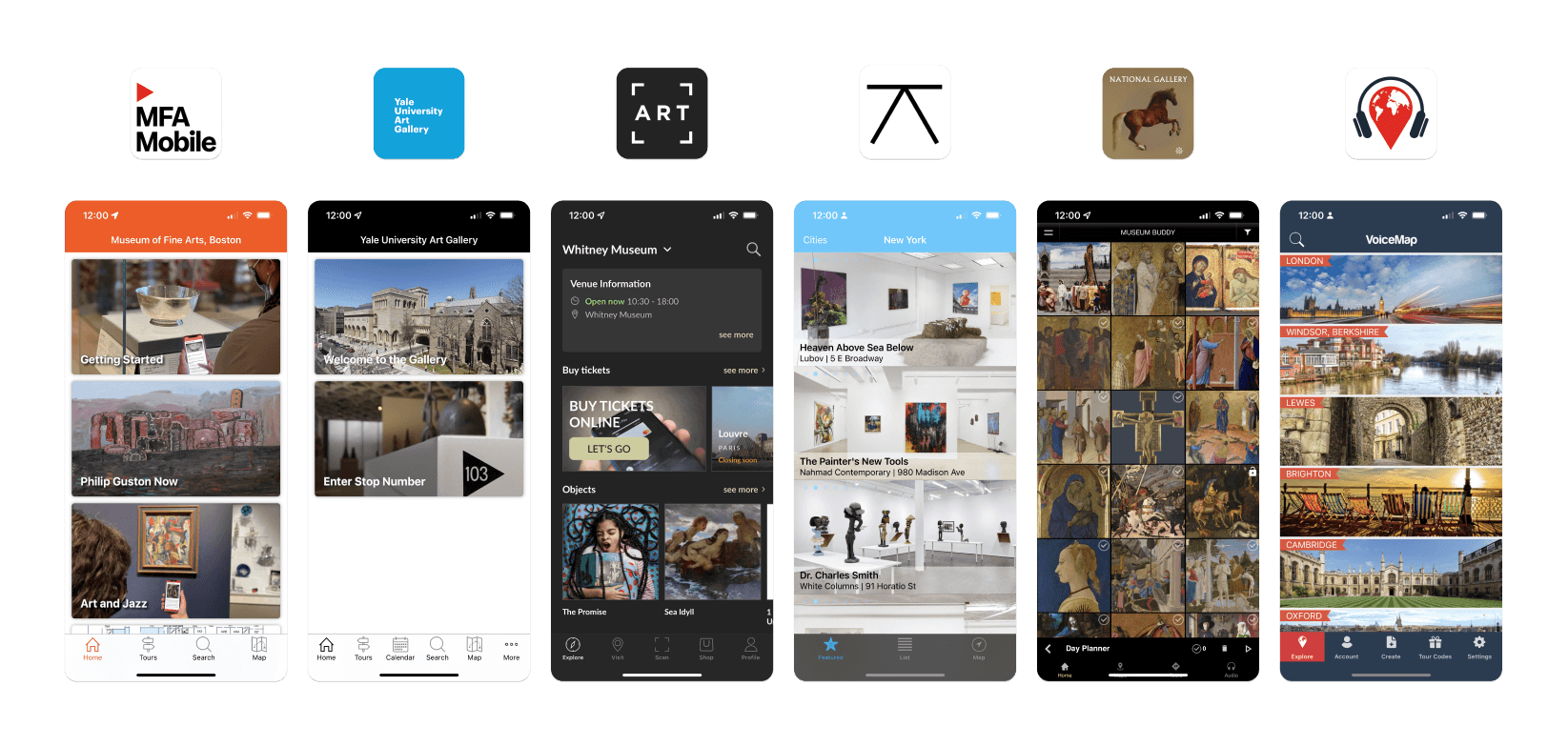
I analyzed my competitors along a rubric of UX & UI criteria, assigning each a rating from 1-10 on interaction, accessibility, user flow, features, visual design, and more.

After concluding my analysis, I sorted out the main things I liked and didn’t like about the product landscape.
What I like:
“Scan” feature creates fun user engagement
Guided audio tours with a variety of narrators
Artist bios and additional information
Detailed imagery of the artwork
Ability to find and view nearby art galleries
Floor map and gallery info (holidays, hours of operation, etc.)
News about artists, ongoing shows/exhibitions
Most popular attractions (what’s hot?)
What I don't like:
Failure to showcase art in an attractive, engaging way
Long, rambling text fields explaining the work
Confusing UX
No user profile or social features (ability to like, share, etc.)
Must pay to take tours, use premium offerings
No way to see art prices or place inquiries
Lack of available languages
Accessibility and usability issues
With these research results synthesized, I now had the information and resources needed move on to the second stage of my design process.
Ideate & build
With the user problem and competitive landscape now defined, it was time to begin brainstorming solutions. I started with several design exercises to get my mind thinking creatively. My favorite was Crazy 8s, a method of the Design Sprint that challenges you to sketch eight distinct ideas in eight minutes. The goal of crazy 8s is to push you to generate a wide variety of solutions to innovate beyond your initial idea. Not all ideas are practical or even realistic. In fact, sometimes the craziest concepts end up giving rise to the most inspiring outcomes…
Prompt: How might we use mobile technology to create a more fun and engaging art gallery experience?
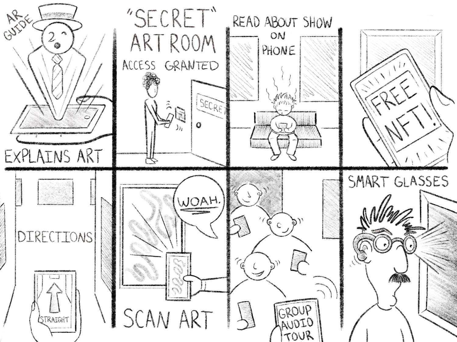
Not only did I have a ton of fun with this exercise, but I came away with some promising thought-starters for further ideation.
User flow outline
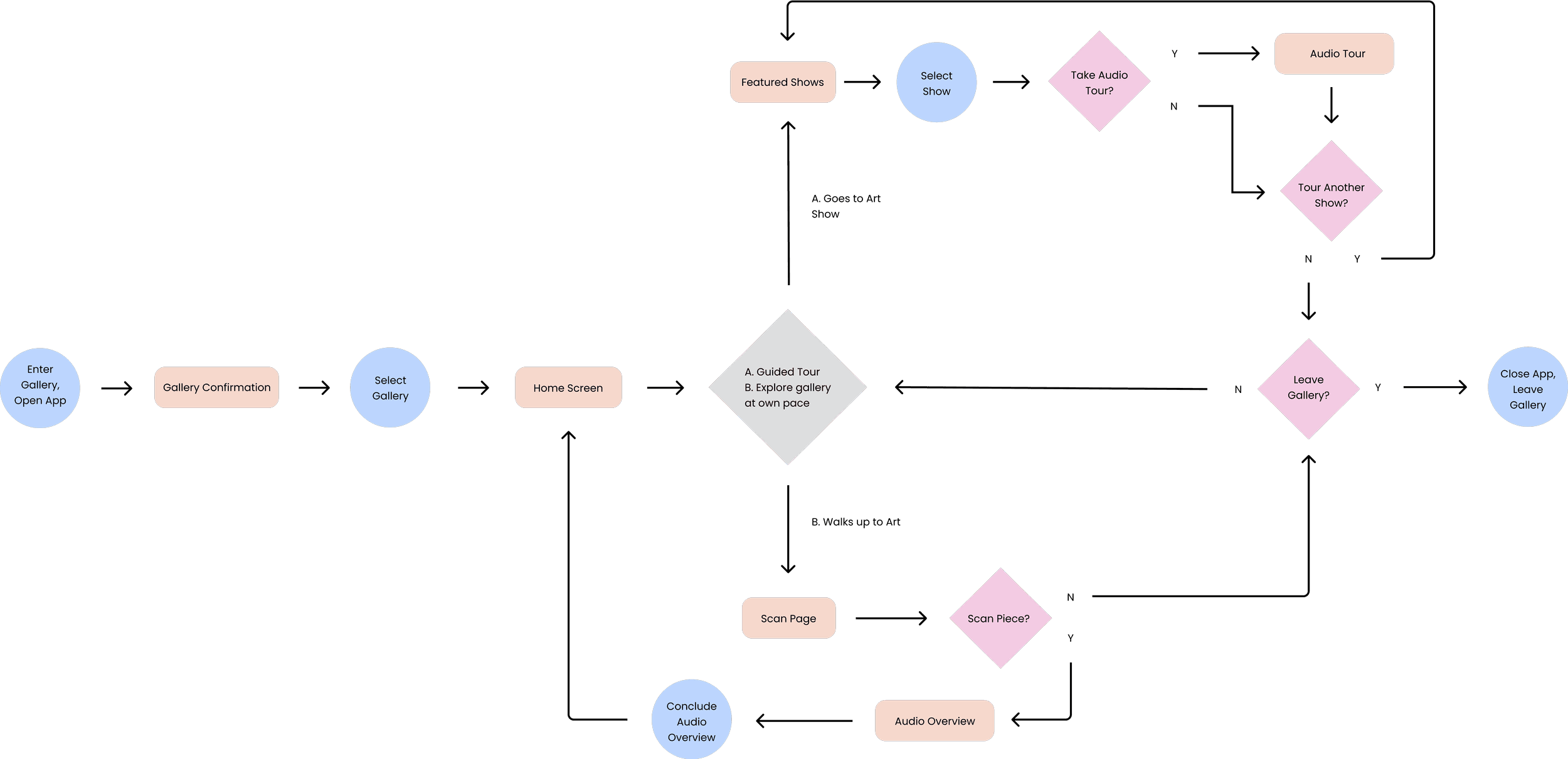
When designing my user flow, I chose to focus on two main journeys determined through research:
A series of guided audio/visual tours that lead the user through the galleryThe ability for the user to select their own route and explore the gallery at their own pace
The user flow outline begins when the user enters a gallery and opens the app, and ends when their art viewing experience is concluded.
Wireframes
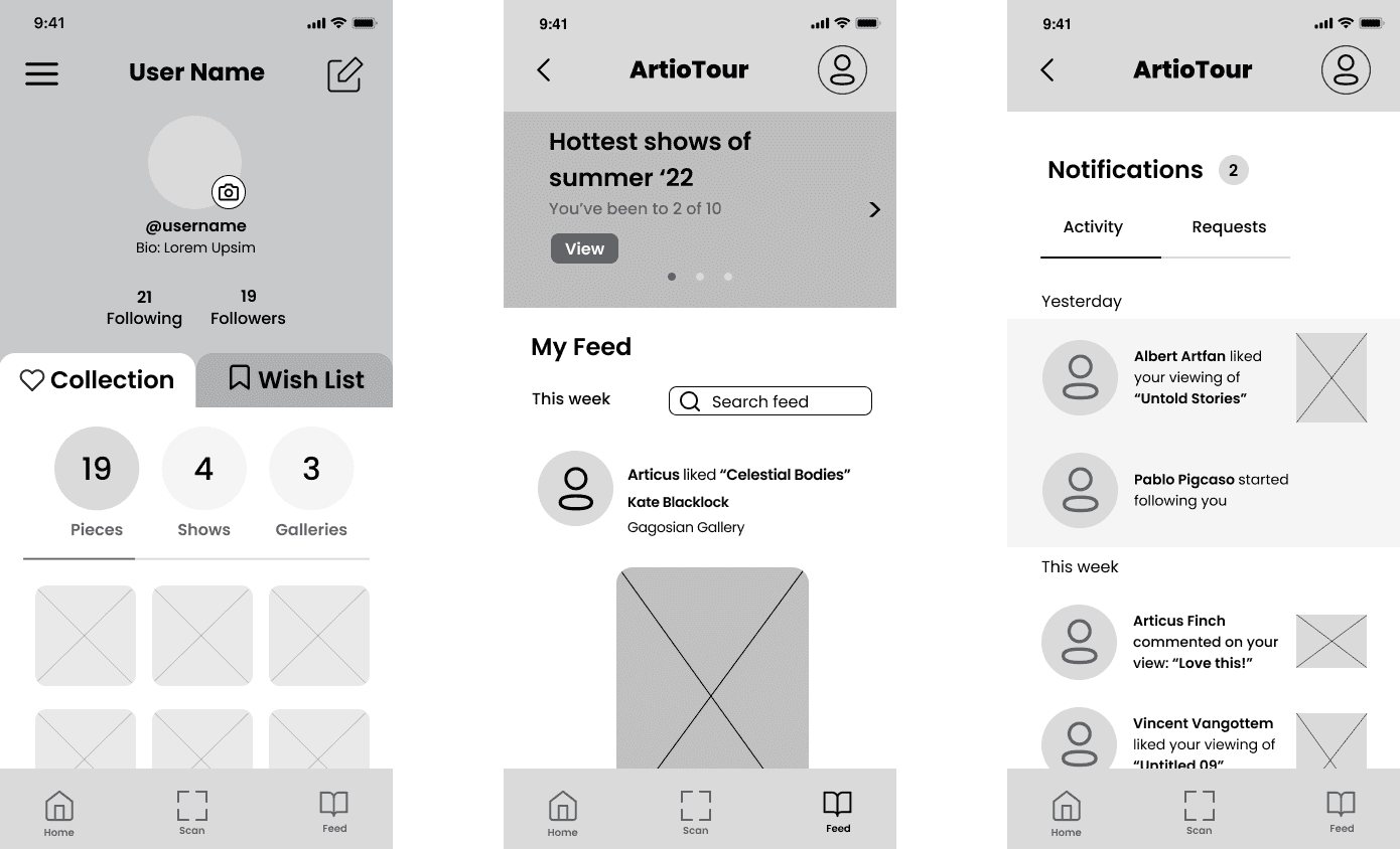
Now that my user journey mapping and storyboarding were complete, it was time to sketch some screens! I spent over a week creating paper wireframes, enjoying the fast, messy, low-commitment nature of working with pen and pencil. I generated dozens of ideas for components and user flows, taking note of my favorites and setting them aside for further revision.
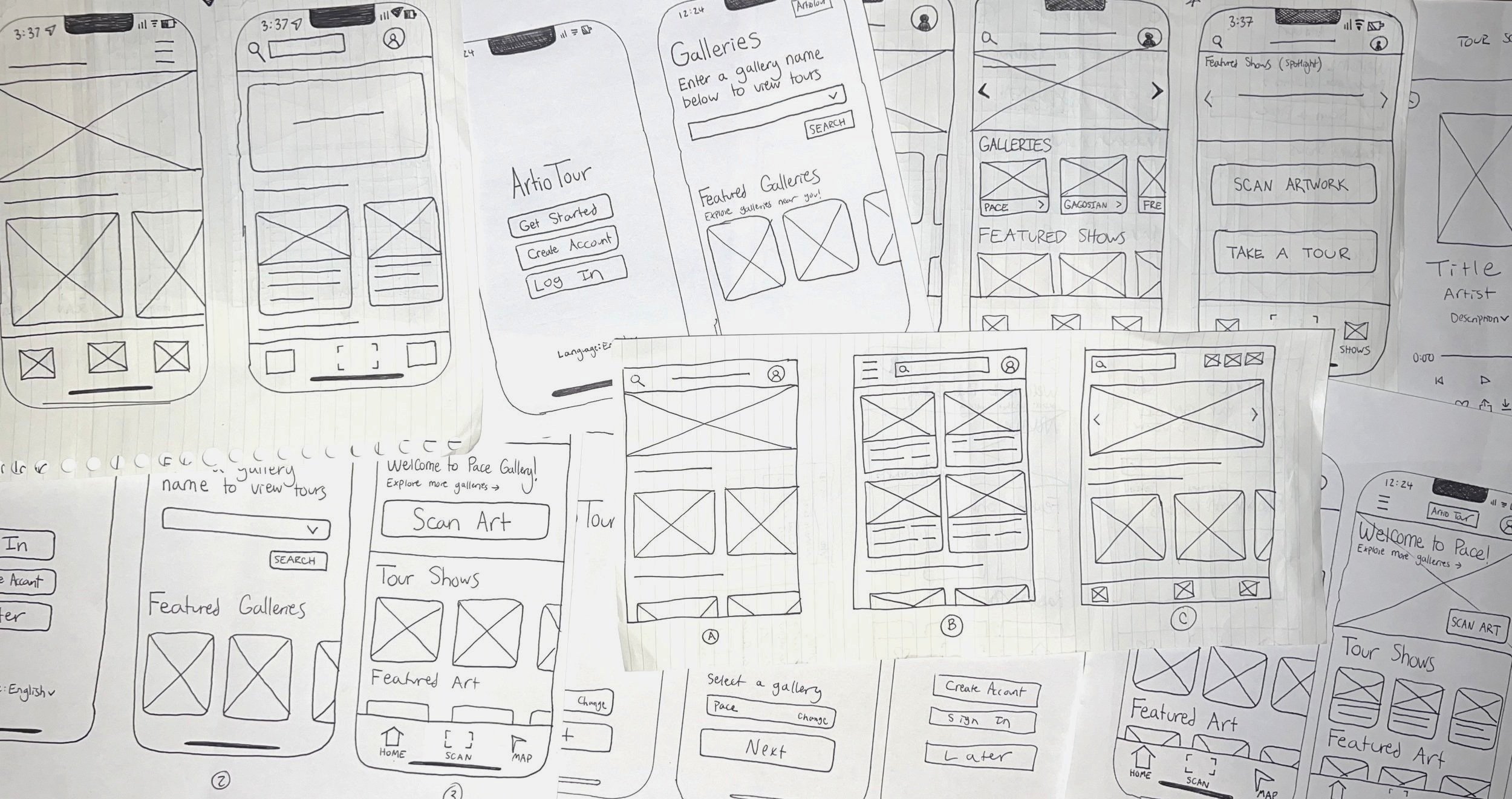
I brought my most successful paper wireframes into Figma, where I created the first digital rendering of a skeleton for the app. To start, I focused on building the most essential screens and flows.

Another set of user flows I knew would be extremely important were the Profile and Feed sections. A social media feature was key, because I wanted users to be able to connect, engage, and share their gallery experiences with each other over the app.
Testing Early Concepts
My next step was to test a low-fi prototype with real users. I conducted five moderated usability studies with volunteers.
I asked participants to each complete the same series of predetermined prompts, observing their thought process and behavior. These prompts included going through the onboarding flow, selecting a gallery, taking a guided tour, scanning and receiving information about a piece of art, and navigating the Profile and Feed sections of the app.
After completing the assigned tasks, I asked volunteers to provide feedback on the experience.
I documented my notes a spreadsheet, where I compiled quotes, observations, and ideas from each usability study. To organize my results, I created an affinity diagram to synthesize the data into groups with common themes or relationships. I used Jamboard to generate lots of sticky notes, color-coded by interview participant. I then grouped sticky notes into categories based on commonality, and was rewarded with some interesting insights...

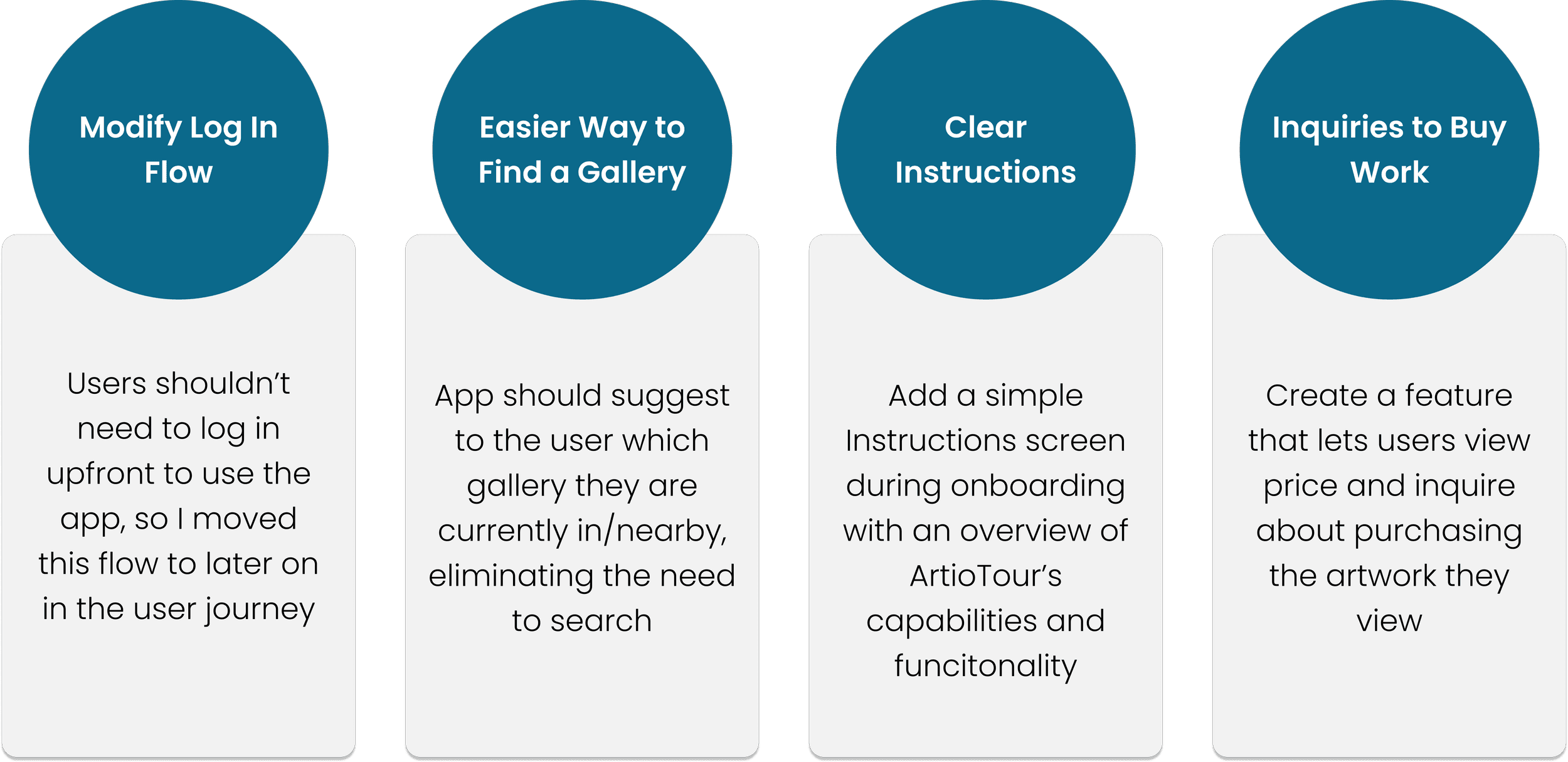
With all the user feedback laid out in front of me, my next round of iterations seemed clear. I focused on four key areas for improvement:
III. Design & Refine
Now that my wireframes and mid-fi prototype were complete, it was time to breathe some life into the user interface.
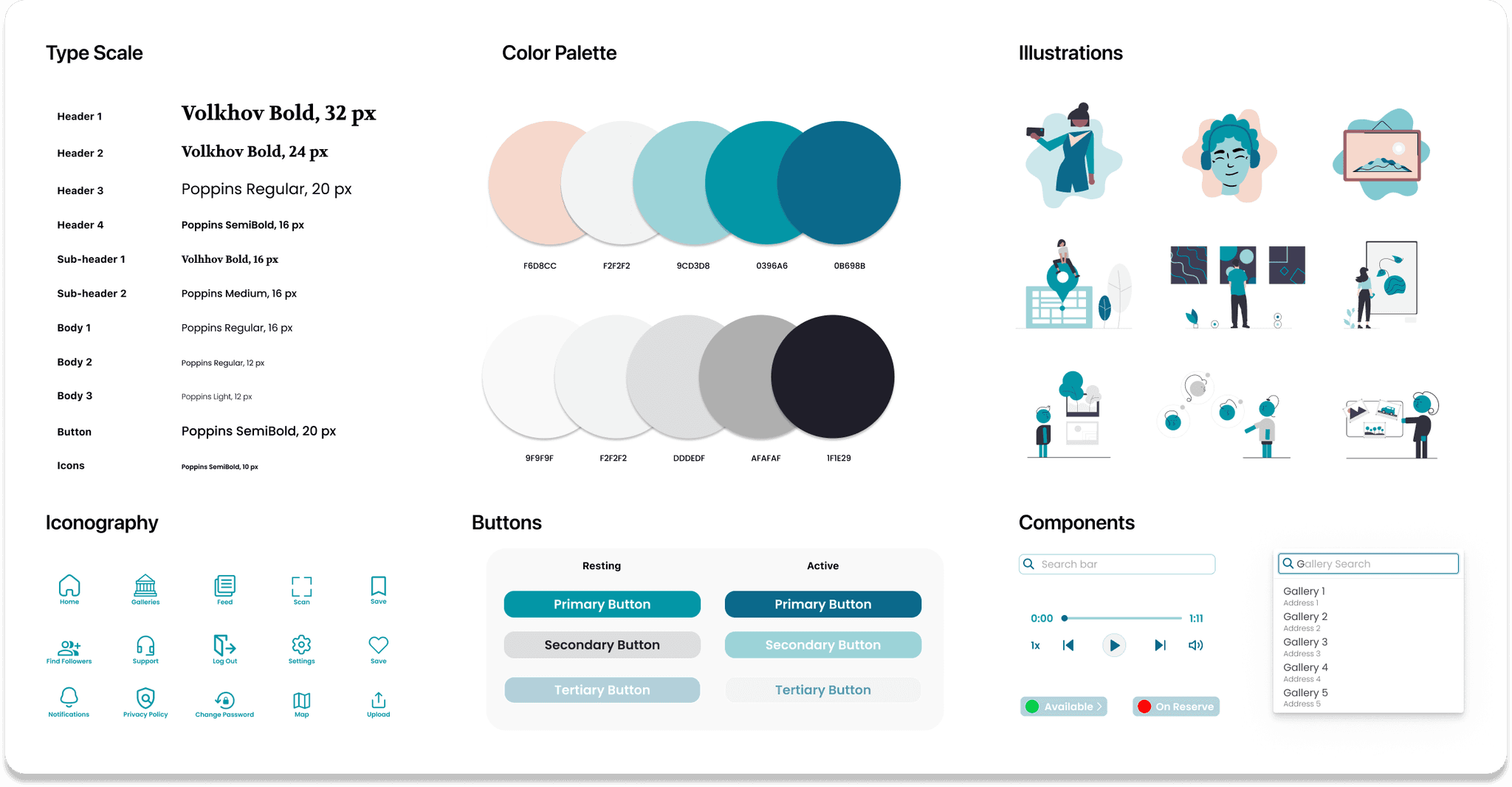
I wanted to give my app a sleek, clean, visually appealing UI that accentuated the featured artwork. This product was meant to be evocative of the gallery environment, so I chose a cool off-white as my primary background color to symbolize gallery walls.
Viewing art is meant to be a calming, contemplative experience, so I needed a visual identity representing tranquility, creativity, and sophistication. I opted for a soothing color palette of blues, turquoises, and teals, and a typography that mixed chic serif headers with palatable sans serif sub-headers and body text.
Sticker Sheet
Keeping these general ideas in mind, I created a sticker sheet to organize and articulate the various elements of my design.
Logo Design
The ArtioTour logo would be a critical part of my product’s brand, so I knew I had to nail it.
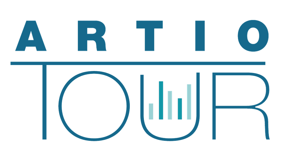
After several design rounds, I ended up with a logo I felt represented the simple and aesthetically pleasing nature of my app. I used three colors from my palette, making an effort to keep the design straightforward and clean.I used a custom font,
choosing to capitalize the entire title to make it prominent. I bolded “ARTIO” for emphasis, aligning it atop the T of “TOUR” which I gave a more subtle weight beneath.As a focal point,
I added an array of multicolored sound bars within the U as an allusion to the audio nature of the app, a central part of its user experience.
Logo outtakes

Final
High-fidelity Mockups
Once the main components of my visual identity were determined, I began construction of high-fidelity mockups.I took time designing and refining each screen, using the updated digital wireframes as a close reference and incorporating the UI elements from my sticker sheet. The result was a set of polished screens, which were beginning to resemble a final product.
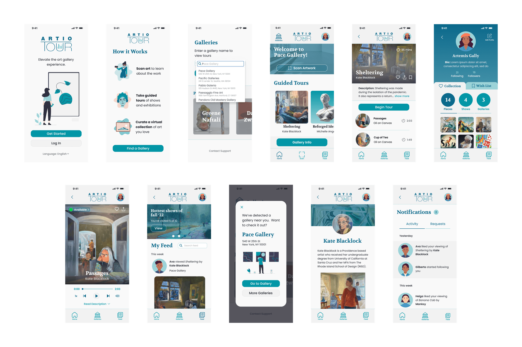
High-fidelity Prototype
With my V1 hi-fi mockups now complete, I was once again ready for prototyping. I took a similar approach to my first two prototypes, but paid special attention to motion design, carefully choosing animations and effects I felt were appropriate when drawing connection points. As I prototyped, I made further revisions to the content, format, and flow of my design, ensuring I had consistency across the product. Once complete, I had a detailed model that closely resembled the look and feel of my final product.
User Testing & Iteration
After finishing a V1 high-fidelity prototype, I conducted one more round of user testing. I followed the exact same process of developing a research plan and conducting moderated usability studies as I did for my low-fidelity prototypes, using a different group of five interview participants. As before,
I asked interviewees to complete a series of prompts, evaluating their performance and feedback and recording notes on a spreadsheet. After concluding all five tests, it was time to gather, organize, and synthesize my research results. This allowed me to develop the insights that would help improve the final product. After performing another affinity mapping exercise, I categorized the changes I needed to make into four buckets:
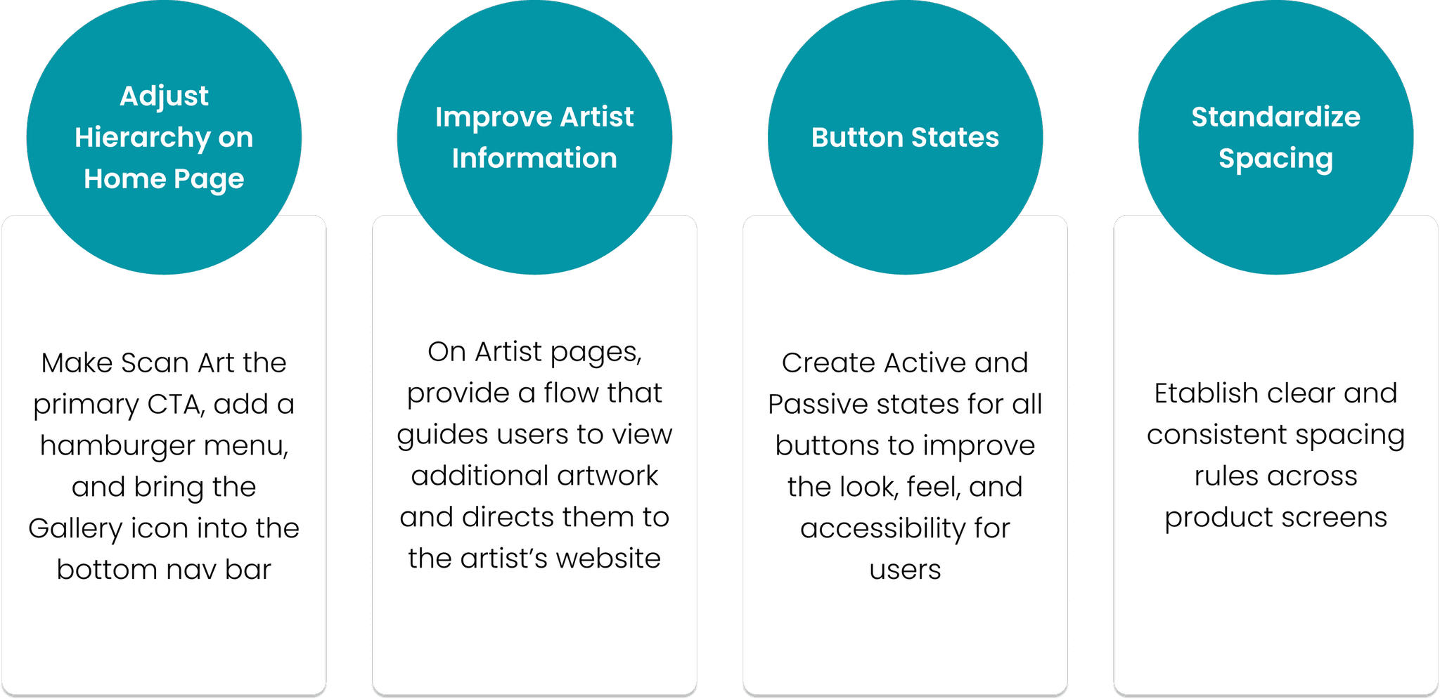
With these insights in hand, I went back to my prototype and made the necessary updates to my product.
Concluding Thoughts
Industry research and user interviews were essential throughout this project. I learned that people love the idea of audio tours, but don’t find them accessible. I also found that while most users don’t care about the ability to purchase art at galleries, a majority want the ability to inquire about the price of work when possible.
Through usability studies and testing, I gained vital information that was not obvious during initial ideation. For example, I found that the social media and connectivity features (Profile and Feed sections) were some of the most popular aspects of the app, and needed to be expanded and amplified. I also found that while some users prefer guided tours, others need a more autonomous option to explore the gallery at their own pace (hence, the lower commitment “Scan Art” feature).
Next Steps
Moving forward, I plan to explore the following opportunities for future updates of ArtioTour:
Improve Gallery Navigation: Leverage digital wayfinding to help users navigate galleries and locate art, especially in larger venues with multiple sections. I identified this gap through testing; participants indicated a strong desire for clear directions when viewing art in unfamiliar spaces.
Expand Artist Capabilities: Develop special profiles artists can use to connect with galleries and market work through the ArtioTour platform. This will empower artists by making it easier to find destinations to showcase their art, giving them time back to focus on their craft.
Integrated Art Purchasing: Create a streamlined process by which gallery visitors can buy art directly through the app. This solves a common user pain point around lack of transparency and accessibility in the art buying experience. It also represents a potential revenue stream for my product.
That’s a wrap! Thank you to everyone who made it this far. I hope you enjoyed learning about my project, and please reach out with any questions or inquiries.


ArtioTour
Elevating the art gallery experience through digital design
Role:
Solo product designer, UX researcher
Product:
Mobile app for iOS
Duration: 3 months (June - September 2022)
Tools:
Figma, Adobe Illustrator
Duration:
6 months (July-December 2022)
Why ArtioTour?
Problem: Despite being a free resource available to the general public, art galleries are considered by many to be inaccessible, snobby, and boring.
Solution: A mobile product that solves the most common challenges with galleries, giving users an accessible, engaging, and enjoyable art viewing experience.

Paolo loves going to galleries with his family, but always struggles to understand the art.

He hates spending time and energy reading long descriptions…this was supposed to be a fun activity!

Luckily, he remembers his friends told him about the ArtioTour app— a game changer at art galleries!

With ArtioTour, Pablo can use his mobile phone to scan the artwork in front of him…

…and receive an entertaining and educational guided overview, directly to his headphones!

Now, Paolo can feel like a true art aficionado and share his learnings with his husband and child.
Research & empathize
I began by identifying my research goals: Understand the biggest challenges people face at art galleriesDiscover what people enjoy most about the art gallery experienceDetermine the best way to deliver an audio/visual tour on a mobile device
Industry research & benchmarking
I conducted primary and secondary research on the art gallery and audio tour industries. My secondary research consisted mainly of reviewing online publications, articles, blogs, and case studies, to gain a comprehensive understanding of the market. I found the following resources particularly helpful:
User interviews & personas
I administered six in-person interviews to understand the different aspirations, challenges, and objectives people have when visiting art galleries.Participants were chosen from a variety of backgrounds, representing diversity in race, gender, ability, and art gallery experience. Next, I gathered my interview findings to construct three user personas. These fictional characters represent important segments of ArtioTour’s target audience.


User journey mapping
Now that I had an understanding of the market, I created user journey maps to visualize the process art gallery visitors take to accomplish their goal.
This is the user journey map I created for Joseph, a college student from Kenya living abroad in Chicago:

I now had enough information to identify common pain points and goals with the art gallery and audio tour experiences:
Pain points:
Gallery assistants, when available, can be unhelpful and rude
Lack of informational content and readily available resources to learn about the artwork on display
Audio tours associated with lugging around old, clunky, annoying equipment
Goals:
Gain insight into the history, process, and meaning behind the artwork
Interact and engage with art an accessible, educational, and fun manner
Keep track of and share the galleries, shows, and pieces you see
Competitive Audit
Continuing my research, I conducted an analysis of six direct and indirect competitor products: MFA Mobile, Yale University Art Gallery, Smartify, See Saw, National Gallery Buddy, and VoiceMap.

I analyzed my competitors along a rubric of UX & UI criteria, assigning each a rating from 1-10 on interaction, accessibility, user flow, features, visual design, and more.

After concluding my analysis, I sorted out the main things I liked and didn’t like about the product landscape.
What I like:
“Scan” feature creates fun user engagement
Guided audio tours with a variety of narrators
Artist bios and additional information
Detailed imagery of the artwork
Ability to find and view nearby art galleries
Floor map and gallery info (holidays, hours of operation, etc.)
News about artists, ongoing shows/exhibitions
Most popular attractions (what’s hot?)
What I don't like:
Failure to showcase art in an attractive, engaging way
Long, rambling text fields explaining the work
Confusing UX
No user profile or social features (ability to like, share, etc.)
Must pay to take tours, use premium offerings
No way to see art prices or place inquiries
Lack of available languages
Accessibility and usability issues
With these research results synthesized, I now had the information and resources needed move on to the second stage of my design process.
Ideate & build
With the user problem and competitive landscape now defined, it was time to begin brainstorming solutions. I started with several design exercises to get my mind thinking creatively. My favorite was Crazy 8s, a method of the Design Sprint that challenges you to sketch eight distinct ideas in eight minutes. The goal of crazy 8s is to push you to generate a wide variety of solutions to innovate beyond your initial idea. Not all ideas are practical or even realistic. In fact, sometimes the craziest concepts end up giving rise to the most inspiring outcomes…
Prompt: How might we use mobile technology to create a more fun and engaging art gallery experience?

Not only did I have a ton of fun with this exercise, but I came away with some promising thought-starters for further ideation.
User flow outline
When designing my user flow, I chose to focus on two main journeys determined through research:
A series of guided audio/visual tours that lead the user through the galleryThe ability for the user to select their own route and explore the gallery at their own pace
The user flow outline begins when the user enters a gallery and opens the app, and ends when their art viewing experience is concluded.

Wireframes
Now that my user journey mapping and storyboarding were complete, it was time to sketch some screens! I spent over a week creating paper wireframes, enjoying the fast, messy, low-commitment nature of working with pen and pencil. I generated dozens of ideas for components and user flows, taking note of my favorites and setting them aside for further revision.

I brought my most successful paper wireframes into Figma, where I created the first digital rendering of a skeleton for the app. To start, I focused on building the most essential screens and flows.

Another set of user flows I knew would be extremely important were the Profile and Feed sections. A social media feature was key, because I wanted users to be able to connect, engage, and share their gallery experiences with each other over the app.

Testing Early Concepts
My next step was to test a low-fi prototype with real users. I conducted five moderated usability studies with volunteers.
I asked participants to each complete the same series of predetermined prompts, observing their thought process and behavior. These prompts included going through the onboarding flow, selecting a gallery, taking a guided tour, scanning and receiving information about a piece of art, and navigating the Profile and Feed sections of the app.
After completing the assigned tasks, I asked volunteers to provide feedback on the experience.
I documented my notes a spreadsheet, where I compiled quotes, observations, and ideas from each usability study. To organize my results, I created an affinity diagram to synthesize the data into groups with common themes or relationships. I used Jamboard to generate lots of sticky notes, color-coded by interview participant. I then grouped sticky notes into categories based on commonality, and was rewarded with some interesting insights...

With all the user feedback laid out in front of me, my next round of iterations seemed clear. I focused on four key areas for improvement:

III. Design & Refine
Now that my wireframes and mid-fi prototype were complete, it was time to breathe some life into the user interface.
I wanted to give my app a sleek, clean, visually appealing UI that accentuated the featured artwork. This product was meant to be evocative of the gallery environment, so I chose a cool off-white as my primary background color to symbolize gallery walls.
Viewing art is meant to be a calming, contemplative experience, so I needed a visual identity representing tranquility, creativity, and sophistication. I opted for a soothing color palette of blues, turquoises, and teals, and a typography that mixed chic serif headers with palatable sans serif sub-headers and body text.
Sticker Sheet
Keeping these general ideas in mind, I created a sticker sheet to organize and articulate the various elements of my design.

Logo Design
The ArtioTour logo would be a critical part of my product’s brand, so I knew I had to nail it.
After several design rounds, I ended up with a logo I felt represented the simple and aesthetically pleasing nature of my app. I used three colors from my palette, making an effort to keep the design straightforward and clean.I used a custom font,
choosing to capitalize the entire title to make it prominent. I bolded “ARTIO” for emphasis, aligning it atop the T of “TOUR” which I gave a more subtle weight beneath.As a focal point,
I added an array of multicolored sound bars within the U as an allusion to the audio nature of the app, a central part of its user experience.
Logo outtakes

Final

High-fidelity Mockups
Once the main components of my visual identity were determined, I began construction of high-fidelity mockups.I took time designing and refining each screen, using the updated digital wireframes as a close reference and incorporating the UI elements from my sticker sheet. The result was a set of polished screens, which were beginning to resemble a final product.

High-fidelity Prototype
With my V1 hi-fi mockups now complete, I was once again ready for prototyping. I took a similar approach to my first two prototypes, but paid special attention to motion design, carefully choosing animations and effects I felt were appropriate when drawing connection points. As I prototyped, I made further revisions to the content, format, and flow of my design, ensuring I had consistency across the product. Once complete, I had a detailed model that closely resembled the look and feel of my final product.
User Testing & Iteration
After finishing a V1 high-fidelity prototype, I conducted one more round of user testing. I followed the exact same process of developing a research plan and conducting moderated usability studies as I did for my low-fidelity prototypes, using a different group of five interview participants. As before,
I asked interviewees to complete a series of prompts, evaluating their performance and feedback and recording notes on a spreadsheet. After concluding all five tests, it was time to gather, organize, and synthesize my research results. This allowed me to develop the insights that would help improve the final product. After performing another affinity mapping exercise, I categorized the changes I needed to make into four buckets:

With these insights in hand, I went back to my prototype and made the necessary updates to my product.
Concluding Thoughts
Industry research and user interviews were essential throughout this project. I learned that people love the idea of audio tours, but don’t find them accessible. I also found that while most users don’t care about the ability to purchase art at galleries, a majority want the ability to inquire about the price of work when possible.
Through usability studies and testing, I gained vital information that was not obvious during initial ideation. For example, I found that the social media and connectivity features (Profile and Feed sections) were some of the most popular aspects of the app, and needed to be expanded and amplified. I also found that while some users prefer guided tours, others need a more autonomous option to explore the gallery at their own pace (hence, the lower commitment “Scan Art” feature).
Next Steps
Moving forward, I plan to explore the following opportunities for future updates of ArtioTour:
Improve Gallery Navigation: Leverage digital wayfinding to help users navigate galleries and locate art, especially in larger venues with multiple sections. I identified this gap through testing; participants indicated a strong desire for clear directions when viewing art in unfamiliar spaces.
Expand Artist Capabilities: Develop special profiles artists can use to connect with galleries and market work through the ArtioTour platform. This will empower artists by making it easier to find destinations to showcase their art, giving them time back to focus on their craft.
Integrated Art Purchasing: Create a streamlined process by which gallery visitors can buy art directly through the app. This solves a common user pain point around lack of transparency and accessibility in the art buying experience. It also represents a potential revenue stream for my product.
That’s a wrap! Thank you to everyone who made it this far. I hope you enjoyed learning about my project, and please reach out with any questions or inquiries.


ArtioTour
Elevating the art gallery experience through digital design
Role:
Solo product designer, UX researcher
Product:
Mobile app for iOS
Duration: 3 months (June - September 2022)
Tools:
Figma, Adobe Illustrator
Duration:
6 months (July-December 2022)
Why ArtioTour?
Problem: Despite being a free resource available to the general public, art galleries are considered by many to be inaccessible, snobby, and boring.
Solution: A mobile product that solves the most common challenges with galleries, giving users an accessible, engaging, and enjoyable art viewing experience.

Paolo loves going to galleries with his family, but always struggles to understand the art.

He hates spending time and energy reading long descriptions…this was supposed to be a fun activity!

Luckily, he remembers his friends told him about the ArtioTour app— a game changer at art galleries!

With ArtioTour, Pablo can use his mobile phone to scan the artwork in front of him…

…and receive an entertaining and educational guided overview, directly to his headphones!

Now, Paolo can feel like a true art aficionado and share his learnings with his husband and child.
Research & empathize
I began by identifying my research goals: Understand the biggest challenges people face at art galleriesDiscover what people enjoy most about the art gallery experienceDetermine the best way to deliver an audio/visual tour on a mobile device
Industry research & benchmarking
I conducted primary and secondary research on the art gallery and audio tour industries. My secondary research consisted mainly of reviewing online publications, articles, blogs, and case studies, to gain a comprehensive understanding of the market. I found the following resources particularly helpful:
User interviews & personas
I administered six in-person interviews to understand the different aspirations, challenges, and objectives people have when visiting art galleries.Participants were chosen from a variety of backgrounds, representing diversity in race, gender, ability, and art gallery experience. Next, I gathered my interview findings to construct three user personas. These fictional characters represent important segments of ArtioTour’s target audience.


User journey mapping
Now that I had an understanding of the market, I created user journey maps to visualize the process art gallery visitors take to accomplish their goal.
This is the user journey map I created for Joseph, a college student from Kenya living abroad in Chicago:

I now had enough information to identify common pain points and goals with the art gallery and audio tour experiences:
Pain points:
Gallery assistants, when available, can be unhelpful and rude
Lack of informational content and readily available resources to learn about the artwork on display
Audio tours associated with lugging around old, clunky, annoying equipment
Goals:
Gain insight into the history, process, and meaning behind the artwork
Interact and engage with art an accessible, educational, and fun manner
Keep track of and share the galleries, shows, and pieces you see
Competitive Audit
Continuing my research, I conducted an analysis of six direct and indirect competitor products: MFA Mobile, Yale University Art Gallery, Smartify, See Saw, National Gallery Buddy, and VoiceMap.

I analyzed my competitors along a rubric of UX & UI criteria, assigning each a rating from 1-10 on interaction, accessibility, user flow, features, visual design, and more.

After concluding my analysis, I sorted out the main things I liked and didn’t like about the product landscape.
What I like:
“Scan” feature creates fun user engagement
Guided audio tours with a variety of narrators
Artist bios and additional information
Detailed imagery of the artwork
Ability to find and view nearby art galleries
Floor map and gallery info (holidays, hours of operation, etc.)
News about artists, ongoing shows/exhibitions
Most popular attractions (what’s hot?)
What I don't like:
Failure to showcase art in an attractive, engaging way
Long, rambling text fields explaining the work
Confusing UX
No user profile or social features (ability to like, share, etc.)
Must pay to take tours, use premium offerings
No way to see art prices or place inquiries
Lack of available languages
Accessibility and usability issues
With these research results synthesized, I now had the information and resources needed move on to the second stage of my design process.
Ideate & build
With the user problem and competitive landscape now defined, it was time to begin brainstorming solutions. I started with several design exercises to get my mind thinking creatively. My favorite was Crazy 8s, a method of the Design Sprint that challenges you to sketch eight distinct ideas in eight minutes. The goal of crazy 8s is to push you to generate a wide variety of solutions to innovate beyond your initial idea. Not all ideas are practical or even realistic. In fact, sometimes the craziest concepts end up giving rise to the most inspiring outcomes…
Prompt: How might we use mobile technology to create a more fun and engaging art gallery experience?

Not only did I have a ton of fun with this exercise, but I came away with some promising thought-starters for further ideation.
User flow outline
When designing my user flow, I chose to focus on two main journeys determined through research:
A series of guided audio/visual tours that lead the user through the galleryThe ability for the user to select their own route and explore the gallery at their own pace
The user flow outline begins when the user enters a gallery and opens the app, and ends when their art viewing experience is concluded.

Wireframes
Now that my user journey mapping and storyboarding were complete, it was time to sketch some screens! I spent over a week creating paper wireframes, enjoying the fast, messy, low-commitment nature of working with pen and pencil. I generated dozens of ideas for components and user flows, taking note of my favorites and setting them aside for further revision.

I brought my most successful paper wireframes into Figma, where I created the first digital rendering of a skeleton for the app. To start, I focused on building the most essential screens and flows.

Another set of user flows I knew would be extremely important were the Profile and Feed sections. A social media feature was key, because I wanted users to be able to connect, engage, and share their gallery experiences with each other over the app.

Testing Early Concepts
My next step was to test a low-fi prototype with real users. I conducted five moderated usability studies with volunteers.
I asked participants to each complete the same series of predetermined prompts, observing their thought process and behavior. These prompts included going through the onboarding flow, selecting a gallery, taking a guided tour, scanning and receiving information about a piece of art, and navigating the Profile and Feed sections of the app.
After completing the assigned tasks, I asked volunteers to provide feedback on the experience.
I documented my notes a spreadsheet, where I compiled quotes, observations, and ideas from each usability study. To organize my results, I created an affinity diagram to synthesize the data into groups with common themes or relationships. I used Jamboard to generate lots of sticky notes, color-coded by interview participant. I then grouped sticky notes into categories based on commonality, and was rewarded with some interesting insights...

With all the user feedback laid out in front of me, my next round of iterations seemed clear. I focused on four key areas for improvement:

III. Design & Refine
Now that my wireframes and mid-fi prototype were complete, it was time to breathe some life into the user interface.
I wanted to give my app a sleek, clean, visually appealing UI that accentuated the featured artwork. This product was meant to be evocative of the gallery environment, so I chose a cool off-white as my primary background color to symbolize gallery walls.
Viewing art is meant to be a calming, contemplative experience, so I needed a visual identity representing tranquility, creativity, and sophistication. I opted for a soothing color palette of blues, turquoises, and teals, and a typography that mixed chic serif headers with palatable sans serif sub-headers and body text.
Sticker Sheet
Keeping these general ideas in mind, I created a sticker sheet to organize and articulate the various elements of my design.

Logo Design
The ArtioTour logo would be a critical part of my product’s brand, so I knew I had to nail it.
After several design rounds, I ended up with a logo I felt represented the simple and aesthetically pleasing nature of my app. I used three colors from my palette, making an effort to keep the design straightforward and clean.I used a custom font,
choosing to capitalize the entire title to make it prominent. I bolded “ARTIO” for emphasis, aligning it atop the T of “TOUR” which I gave a more subtle weight beneath.As a focal point,
I added an array of multicolored sound bars within the U as an allusion to the audio nature of the app, a central part of its user experience.
Logo outtakes

Final

High-fidelity Mockups
Once the main components of my visual identity were determined, I began construction of high-fidelity mockups.I took time designing and refining each screen, using the updated digital wireframes as a close reference and incorporating the UI elements from my sticker sheet. The result was a set of polished screens, which were beginning to resemble a final product.

High-fidelity Prototype
With my V1 hi-fi mockups now complete, I was once again ready for prototyping. I took a similar approach to my first two prototypes, but paid special attention to motion design, carefully choosing animations and effects I felt were appropriate when drawing connection points. As I prototyped, I made further revisions to the content, format, and flow of my design, ensuring I had consistency across the product. Once complete, I had a detailed model that closely resembled the look and feel of my final product.
User Testing & Iteration
After finishing a V1 high-fidelity prototype, I conducted one more round of user testing. I followed the exact same process of developing a research plan and conducting moderated usability studies as I did for my low-fidelity prototypes, using a different group of five interview participants. As before,
I asked interviewees to complete a series of prompts, evaluating their performance and feedback and recording notes on a spreadsheet. After concluding all five tests, it was time to gather, organize, and synthesize my research results. This allowed me to develop the insights that would help improve the final product. After performing another affinity mapping exercise, I categorized the changes I needed to make into four buckets:

With these insights in hand, I went back to my prototype and made the necessary updates to my product.
Concluding Thoughts
Industry research and user interviews were essential throughout this project. I learned that people love the idea of audio tours, but don’t find them accessible. I also found that while most users don’t care about the ability to purchase art at galleries, a majority want the ability to inquire about the price of work when possible.
Through usability studies and testing, I gained vital information that was not obvious during initial ideation. For example, I found that the social media and connectivity features (Profile and Feed sections) were some of the most popular aspects of the app, and needed to be expanded and amplified. I also found that while some users prefer guided tours, others need a more autonomous option to explore the gallery at their own pace (hence, the lower commitment “Scan Art” feature).
Next Steps
Moving forward, I plan to explore the following opportunities for future updates of ArtioTour:
Improve Gallery Navigation: Leverage digital wayfinding to help users navigate galleries and locate art, especially in larger venues with multiple sections. I identified this gap through testing; participants indicated a strong desire for clear directions when viewing art in unfamiliar spaces.
Expand Artist Capabilities: Develop special profiles artists can use to connect with galleries and market work through the ArtioTour platform. This will empower artists by making it easier to find destinations to showcase their art, giving them time back to focus on their craft.
Integrated Art Purchasing: Create a streamlined process by which gallery visitors can buy art directly through the app. This solves a common user pain point around lack of transparency and accessibility in the art buying experience. It also represents a potential revenue stream for my product.
That’s a wrap! Thank you to everyone who made it this far. I hope you enjoyed learning about my project, and please reach out with any questions or inquiries.
